
What Makes a Good Graphic Design? Easy Rules to Follow
Good graphic design doesn’t just look pretty it communicates, engages, and creates impact. But what makes a design truly effective? Many beginners rely on instinct, but understanding the core principles ensures your work stands out.
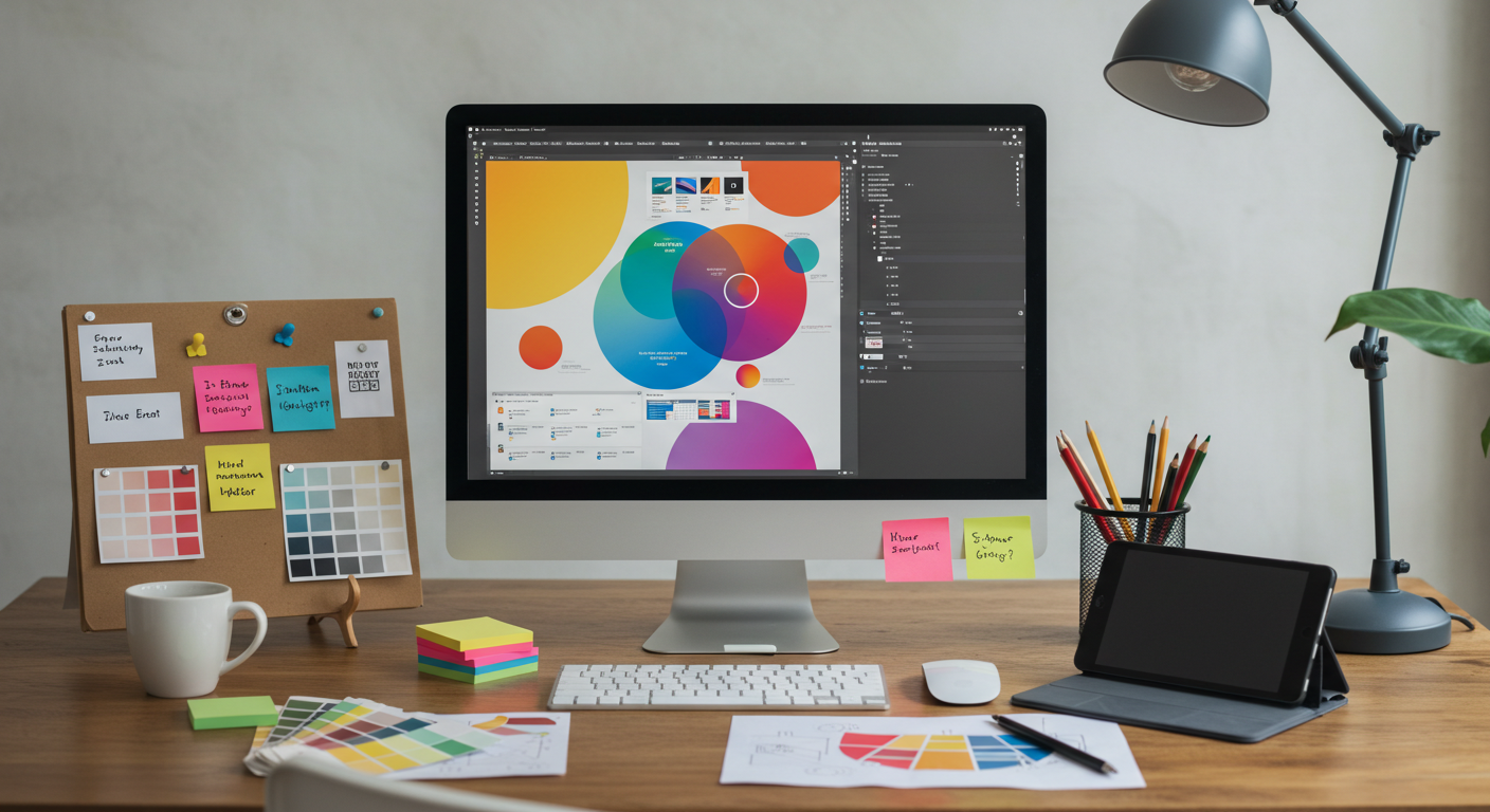
Here’s a simple guide to creating graphic designs that actually work.
1. Clarity Is Key
- A design must convey the message clearly
- Avoid clutter; every element should have a purpose
- Use hierarchy in text to guide the viewer’s eyes
2. Color Harmony
- Choose colors that complement each other
- Limit your palette to maintain consistency
- Understand color psychology blue conveys trust, red grabs attention

3. Typography Matters
- Fonts communicate tone and mood
- Combine 1–2 fonts to avoid distraction
- Ensure readability for all devices
4. Balance & Alignment
- Align elements for a clean and organized look
- Symmetry and spacing make designs pleasing to the eye
- Test how your design appears on different screen sizes
5. Use Visual Hierarchy
- Highlight the most important elements first
- Use size, color, and placement strategically
- Guide viewers to take desired action
Real-Life Example
A social media campaign for a local café used:
- Bold typography for promotions
- Complementary colors for attention
- Clear hierarchy for menu highlights
Result: 30% more engagement compared to previous posts.
Good graphic design combines clarity, color harmony, typography, balance, and hierarchy. Follow these rules consistently, and your designs will communicate effectively and attract the audience.
Keep it simple, purposeful, and visually pleasing. Every good design starts with the basics.

Empowering personal brands with bold strategy, design, and digital presence.
Contact Us
Our Services
- Copyright 2025 All rights reserved
- Privacy Policy
- Terms and Conditions